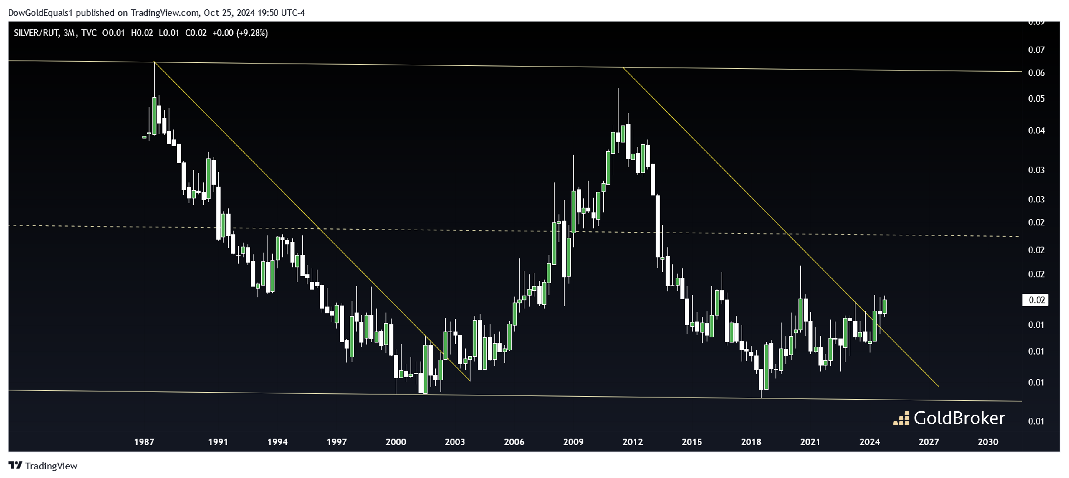
This week, we’ll look at a few ratio charts of silver vs some major US stock indexes to see just how inexpensive silver remains against equities. The first chart of Silver/NASDAQ shows price as having traded within a channel going back to the 1980s. There are a couple fascinating elements to the chart: first, the resistance line of the 80s and 90s that eventually gave way to silver’s secular bull of the 2000’s appears to have cloned itself beginning in 2011. Second, the ratio has only this year climbed above its lower rail and remains historically exceptionally low. The last time the ratio rocketed off the lower rail, silver prices climbed 10X over the next decade!
The second chart is of Silver/Russell 2000 (US small caps). Like with NASDAQ, we see price trading within a picture perfect channel with current price near the lower rail. I have drawn a couple of cloned resistance lines here too, though they may not be quite as compelling as those in the Silver/NASDAQ chart. What does seem apparent, however, is that the same rounded bottom that formed over the 1990s and 2000s appears to be replicating itself again over the past 10 years.
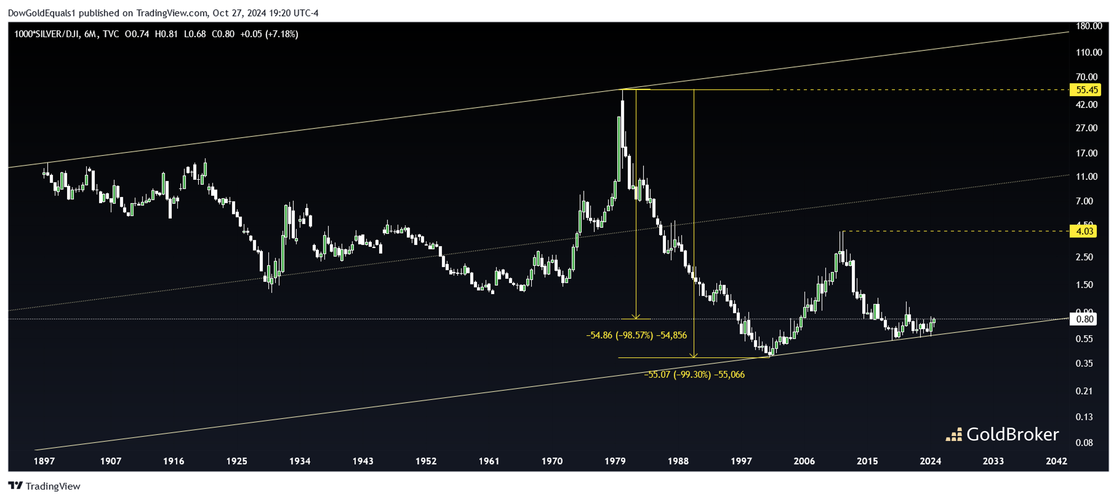
The third chart is of Silver/DJI (Dow Jones Index). No surprise, price again has traded within a neat channel – this one going way back to 1900. The focus of this chart is just how far silver has fallen relative to equities. From 1980 to 2001, silver fell more than 99% relative to the dow! Even today, price remains down more than 98% from the all time high. To get back to 2011 levels, silver would have to rise 5X against the dow. To get back to that 1980 high, silver would have to rise about 70X against the dow. While we may not ever see that 1980 ratio again, one thing is clear: silver is indeed quite inexpensive relative to US stocks.
Written by Mike Roy of GoldBroker


